Cards
A card is a sheet of material that serves as an entry point to more detailed information.
Cards are a convenient means of displaying content composed of different types of objects. They’re also well-suited for presenting similar objects whose size or supported actions can vary considerably, like photos with captions of variable length. Cards may contain a photo, text, and a link about a single subject. They may display content containing elements of varying size, such as photos with captions of variable length. A card collection is a layout of cards on the same plane.
Cards can contain a link or the whole card can be a link. Where the whole card is a link, ensure you use cursor: pointer and increase the size of the dropshadow using the z-depth class
When to use
Use a card layout when displaying content that:
- Comprises multiple data types, such as images, movies, and text
- Supports content of highly variable length
- Contains interactive content
- Contains multiple actions
 Card Title
I am a very simple card. I am good at containing small bits of information. I am convenient because I require little markup to use effectively.
Common card types across the studio
Darft card

Card design used to indicate a draft project. A delete action is denoted by an icon.
Folder card
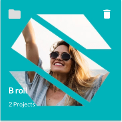
Card design used to indicate a folder of projects. A delete action is denoted by an icon and a folder icon is used to help distinguish the card.
Project card
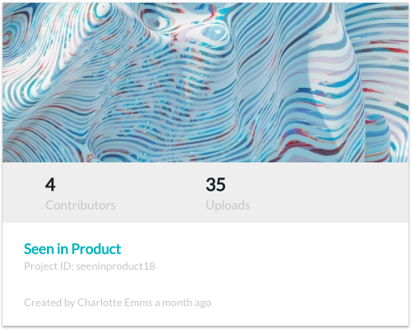
Card design to indicate a Project in the Seenit studio. The whole card is clickable, and on hover, the z-depth increases.
Footage card
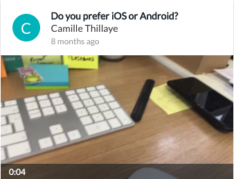
Card design to indicate a Footage item in the Seenit studio. The whole card is clickable, and on hover, the z-depth increases and actions appear as icons. Upon click, an expanded preview appears underneath with additional options.