Logo
The ‘S’ Logo is one of our most recognised and beloved assets. It’s used to represent Seenit the product (studio or mobile app). The primary use of the ‘S’ Logo is to promote Seenit through all mediums. For example, when you say, ‘Collaborate with us” and link to our website, it’s appropriate to use the ‘S’ Logo. The ‘S’ Logo may not be used side by side with other social media Logos.
The ‘S’ should be used in place of the main Seenit Logo. This may be where space is limited or a full Logo would not be appropriate. Consider whether the main Logo could be used in place of the ‘S’ Logo. The main Logo should always take priority wherever possible.

3.8mb download
Size
The ‘S’ Logo should never appear smaller than 16 pixels in height. Smaller than 16 pixels means you lose the detail.

┣━ 16 pixels
Colour
The correct colour versions to use are the steel, blue or reversed-out to white. If you are unable to use the correct colour due to technical limitations, you may revert to black and white.


Space
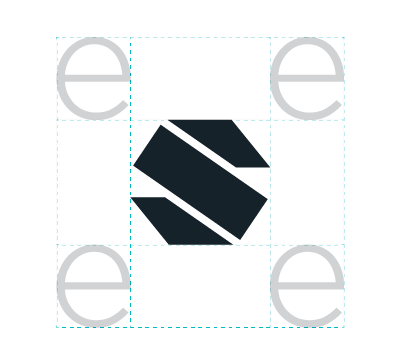
To preserve the integrity of the ‘S’ Logo, always maintain a minimum clear space around the Logo. This clear space insulates our ‘S’ Logo from distracting visual elements, such as other Logos, copy, illustrations or photography.
Maintaining Shape and Proportions
To ensure accurate and consistent use, never alter, rotate, embellish or attempt to recreate the ‘S’ Logo. The proportions and shape of the ‘S’ Logo should never be altered for any reason. To resize, hold the ‘Shift’ key in most software programs to maintain the proportions while scaling up or down.


Do's

Do maintain proportions and clear space.
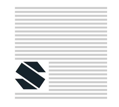
Use the ‘S’ Logo when space is limited.

Use the ‘S’ Logo to indicate seenit content loading.

Use the steel or teal ‘S’ Logo over light images.
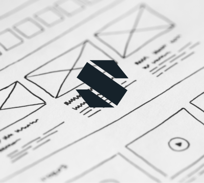
Use the reversed-out ‘S’ Logo over dark images.
Don'ts
Recolour the ‘S’ Logo.

Change the ‘S’ in anyway.

Distort the ‘S’ Logo.
Add effects to the Logo.
Make the Logo 3D.
Main logo
The ‘S’ should be used in place of the main Seenit Logo. This may be where space is limited or a full Logo would not be appropriate. Consider whether the main Logo could be used in place of the ‘S’ Logo. The main Logo should always take priority wherever possible.

3.7mb download
Size
The main Logo should never appear smaller than 16 pixels in height. Smaller than 16 pixels means you lose the detail.

┣━ 16 pixels
Colour
The correct colour versions to use are the steel, blue or reversed-out to white. If you are unable to use the correct colour due to technical limitations, you may revert to black and white.


Space
To preserve the integrity of the Logo, always maintain a minimum clear space around the Logo. This clear space insulates our Logo from distracting elements, such as other Logos, copy, illustrations or photography. Use half of the Logo width and height as spacing.
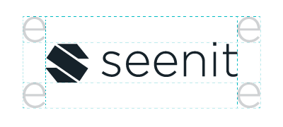
Maintaining Shape and Proportions
To ensure accurate and consistent use, never alter, rotate, embellish or attempt to recreate the Logo. The proportions and shape of the Logo should never be altered for any reason. To resize, hold the ‘Shift’ key in most software programs to maintain the proportions while scaling up or down.


Do's

Do maintain proportions and clear space.

Use the Logo for hero content.
Use the Logo for supporting content.
Use the reversed-out Logo over dark images.
Use the steel or teal Logo over light images.
Don'ts
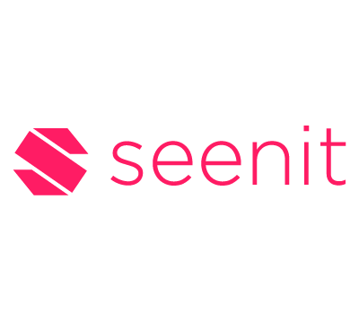
Recolour the Logo.

Change the Logo in anyway.
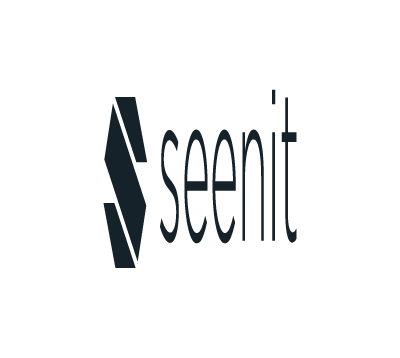
Distort the Logo.
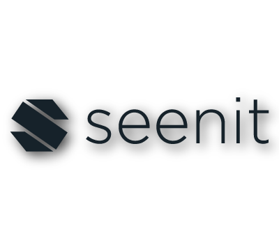
Add effects to the Logo.

Make the Logo 3D.
Seenit world logo
The same rules for the main logo apply to the Seenitworld Logo. The Logo should be used to accompany any Seenitworld content.
