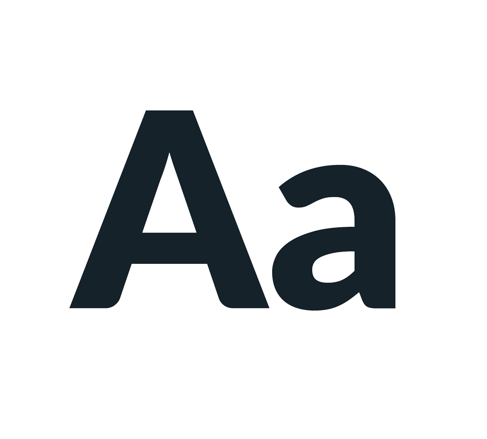
Type
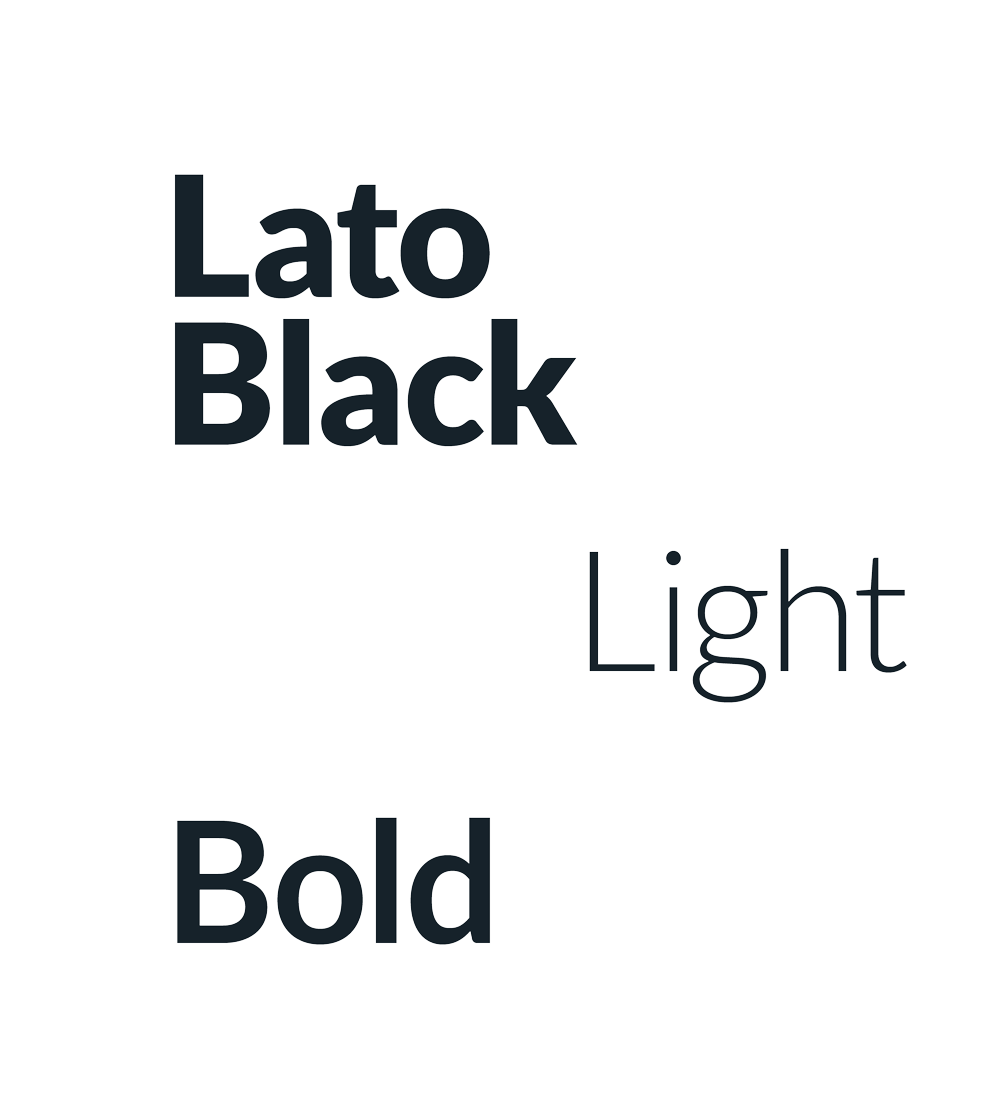
Our typeface is bold, simple, and universal — it is the common thread throughout our brand. We use Lato Bold and Black for headings and Lato Light for body copy. The choice between using Bold or Black is at your discretion. Lato bold is used for links and buttons.
Lato is a sans-serif typeface family designed in the Summer 2010 by Warsaw- based designer Łukasz Dziedzic. Lato is Polish for Summer. Dziedzic wanted to create a typeface that would seem quite ‘transparent’ when used in body text but would display some original traits when used in larger sizes. He used classical proportions (particularly visible in the uppercase) to give the letter-forms familiar harmony and elegance. At the same time, he created a sleek sans-serif look, which makes evident the fact that Lato was designed in 2010 — even though it does not follow any current trend.
file_downloadDownload Lato
500 kb download
Size
When using our typeface, follow the rules below wherever possible. This helps to maintain a consistent look and feel across all materials.
- Ligatures are accepted. fi fl
- Italics are accepted. Italics
- Tracking should be set to 10 by default.
- Kerning should be done optically.
- Embolden text by setting the weight to bold. Bold type
Heading 1
Black 32pt
Headline
Black 24pt
Title
Bold 20pt
Subhead
Regular 16pt
Body
Regular 14pt